Process Graph (P-Graph)
As long as you have technology data inputted in the model, you can access the Process graph. A process graph is a diagram that contains all possible combinations of the technologies and products in the system. This allows you to quickly and easily identify all potential supply chain pathways.
In a process diagram, raw materials are depicted as yellow circles, technologies are depicted as gray rectangles, intermediate products are depicted as blue circles, and final products are depicted as green circles.
P-Graph Example
The example below shows a p-graph for a generic system containing three technologies.
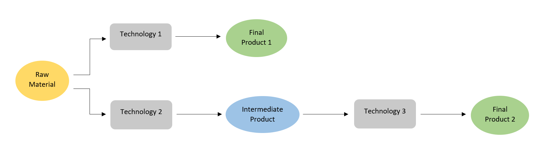
In this example, the raw material can go through technology 1 or technology 2. Technology 1 produces a final product, which can then be sold to customers. Technology 2 produces an intermediate product, which can be further processed via technology 3, and it produces a different final product than technology 1.
Nutrient Pollution Control Example
Technologies do not have to take in only one material and only output one product. There can be many combinations of materials, technologies, and products. An example of a simplified p-graph for the nutrient pollution case study is shown below.
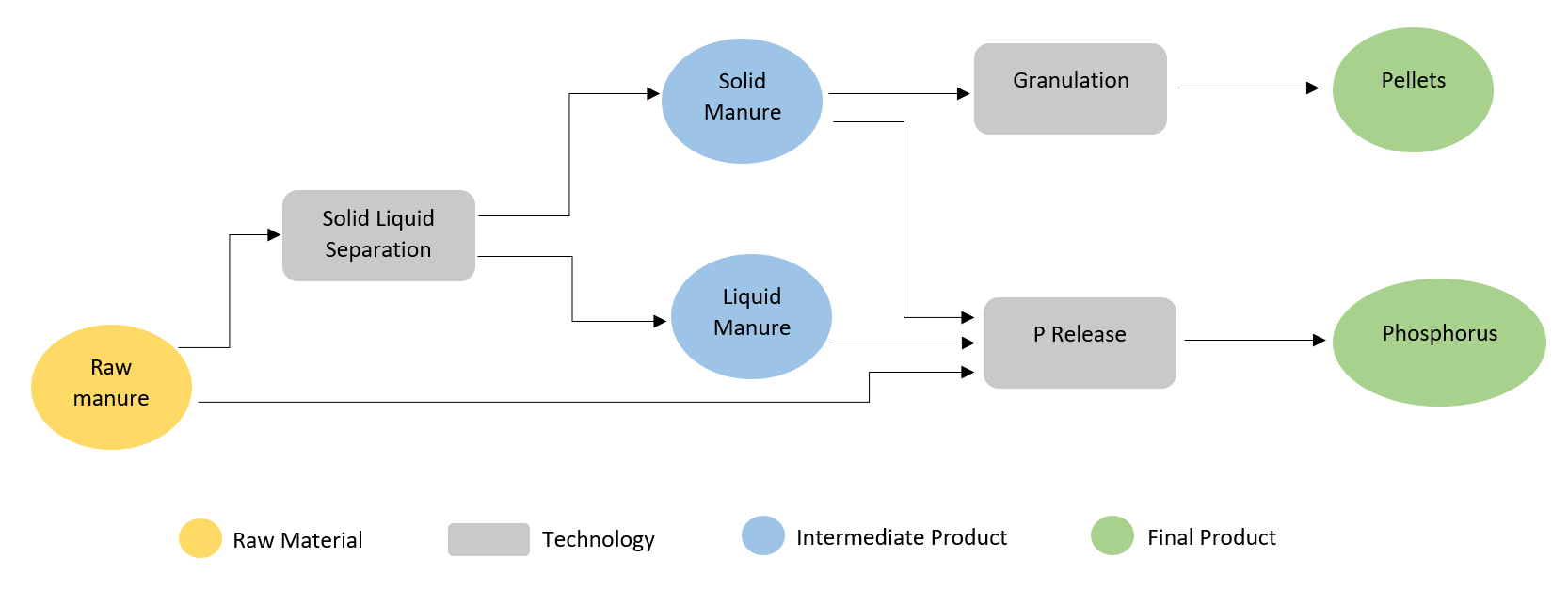
In this example, raw manure can go through solid-liquid separation (SLS) technology or P Release technology. SLS produces two intermediate products, the solid component can be further processed into pellets while the liquid component can go through P release technology to generate phosphorus.
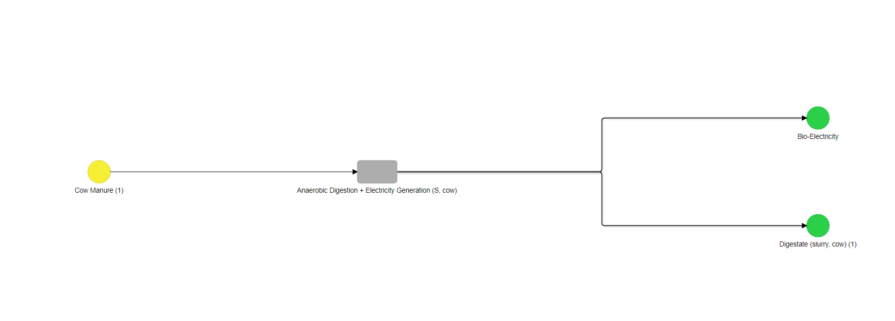
Waste to Energy Example
The image below shows an example of a P-Graph generated by ADAM. This is the P-graph shown for the Waste to Energy case study. Based on the P-Graph, the Waste to Energy case study only has one type of technology in the system which is an Anaerobic Digestion + Electricity generation technology.