Interpreting the Results
After the model has finished running, you can view the results. The results window consists of three sections: Results Summary, Download Resutls, and Visualization.
In this tutorial, we will go over the various sections of the results and how to interpret them.
Results Summary
The results summary section gives a brief overview of the economic performance of the system; it consists of several categories: total social welfare, total revenue, total supply cost, total transportation cost, total technology operational cost, total annulized investment cost. The table below gives a brief description of each category and its meanings.
| Result Category | Description |
|---|---|
| Total Social Welfare | The net economic performance of the system; it can be calculated by summing up all the costs and subtracting them from the total revenue. A positive number indicates that the system is profiting, and a negative number indicates that the system is suffering a loss. |
| Total Revenue | The amount of money that the demand nodes spend to get a product. |
| Total Supply Cost | The money that the system pays the supplier for the supplier to provide the product. A positive number indicates that the system is losing money to the supplier. A negative number indicates that the system is gaining money from the supplier. |
| Total Transportation Cost | The money spent to transport the goods. |
| Total Technology Operational Cost | The money spent to operate the technology. |
| Total Annulized Investment Cost | The money spent to build the technology. |
Now that we have reviewed the result summary categories, we can apply these definitions to interpret the Waste to Energy, Low Electricity price scenario results.
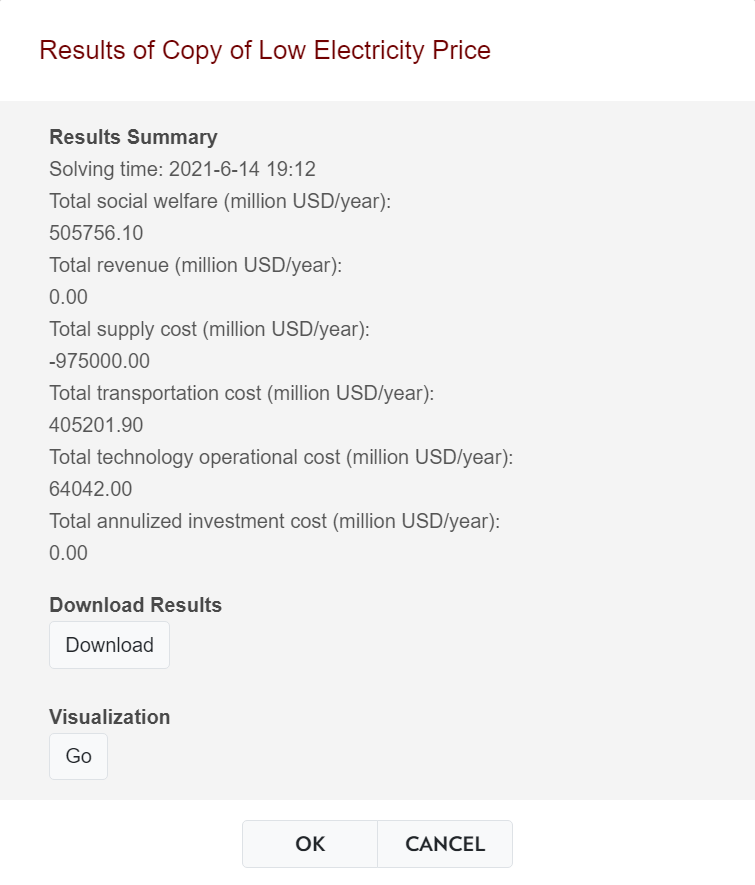
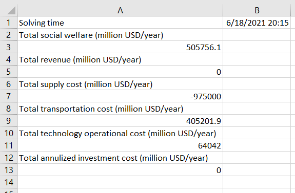
The system has social welfare of 505,756 million USD/year which indicates that it is profiting in this scenario. The revenue is zero because the disposal node is not paying any money to obtain the waste product. The supply cost is -975,000 million USD/year. This means that the system is gaining 975,000 million USD/year from the suppliers. The transportation costs are 405,201.90 million USD/year. the operating cost is $64,042 million/year. The investment cost is zero because the technologies were already built.
The reason why ADAM categorizes the money from suppliers as a negative cost rather than a positive revenue is that suppliers have to receive money before they supply a product in a traditional market but that is not true in a waste management system. For example, a dairy farmer needs to get paid in order to offer their milk to the market; however, in a waste management scenario, the opposite is true. Waste is an undesirable product so suppliers will pay the system to get rid of their waste. This results in a negative supply cost since the system is profiting from the supply of waste.
Download Results
You can also download the results in the form of CSV files. For each model, there may be different result CSV files depending on the model-type and the number of products that you have in your system.
The table below gives a brief overview of the different types of result files.
| Result File | Description |
|---|---|
| clearing_prices | The real prices of the products at each node. This file is only generated for management-type models. |
| demand_results | Contains information on the products and amount of product that is transported to each demand node. |
| flow_results | Shows the amount of product flowing from one node to another. In the left column are the nodes which are supplying the product. The top row is the nodes that are receiving the product. |
| installment_results | A list of the installed technologies and their locations. This file is only generated for design-type models. |
| results_summary | A file containing the results summary of the model. |
| supply_results | A list of the supply nodes and how much product they are supplying to the system. |
| techsite_results | A list of the amount of product processed at each technology site. |
Now that you have been introduced to each of the file types, we will use the Waste to Energy, Low Electricity Price scenario to explain each file in more detail. For this example, you can download the result files here.
Clearing Prices File
The clearing prices file for the Waste to Energy case study is shown below. The clearing price is the real price of the product at that node. This is different from the supply and demand prices that we set in the model.
When we defined the supply and demand prices, those were the maximum prices that the supply and the demand nodes were willing to pay. For example, a CAFO is willing to spend up to $5 to get rid of their waste; however, if a customer is willing to take that waste for $3, the CAFO will gladly get rid of their waste for less.
Below are the clearing price file results for the Waste to Energy, Low Electricity Incentives case study example.
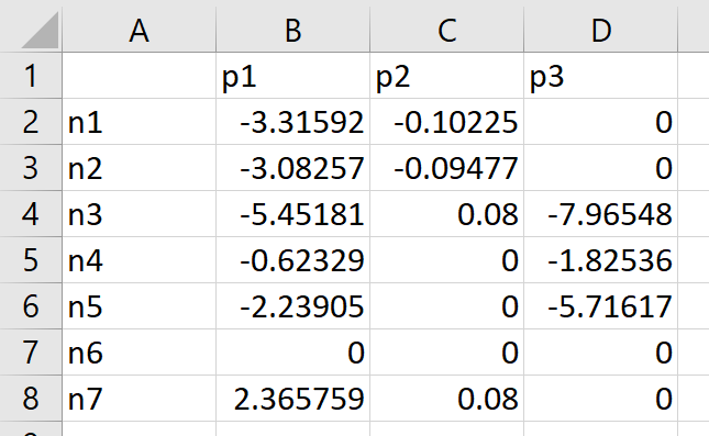
The column on the left indicates the node at which the transaction is taking place, the top row is the products being traded, and the numbers in the center are the prices at which the transactions are taking place.
You can interpret each of the prices in this way: if [product] were to be traded at [node], then the transaction price would be [price]. For example, the interpretation of the -5.45 price in cell B4 of the excel sheet would be the following: if p1 were to be traded at n3, then the transaction price would be -$5.45 per unit of p1. A negative price indicates that the seller loses money, while the buyer gains money.
You can also relate this interpretation to the type of node. For example, n1 is a supply node that is supplying product p1 at a price of -$3.32 per unit of p1. Additionally, if n1 also demanded p2, -$0.10 would be the price at which n1 would buy p2. If the node in question does not supply or demand the products listed, the prices would just represent the prices of the product if they were sold at that location.
Demand Results File
The demand results file contains information on the type of product and the amount of product that the demand node receives for the solved system.
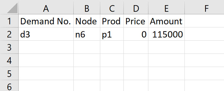
In this example, we can see that demand node d3 (also denoted as node n6) receives 115,000 units of p1 in the optimal system.
Flow Results File
The results zip file may contain multiple flow results files depending on the number of products in your system. In the Waste to Energy case, there are three flow result files, one for each of the three products being transferred: cow manure (p1), bio-electricity (p2), and digestate (p3).
The flow results for p1 are shown below:

The left column indicates the node that is supplying the product, and the top row indicates the node that is receiving the product. This flow results file is indicating that 65,000 units of p1 are flowing from n1 to n6, 35,000 units of p1 are flowing from n2 to n6, and 15,000 units of p1 are flowing from n3 to n6.
Installment Results File
The installment results file is only generated for design-type models, so the Waste to Energy example does not have an installment results file. Instead, we will show an example installment results file from another model.
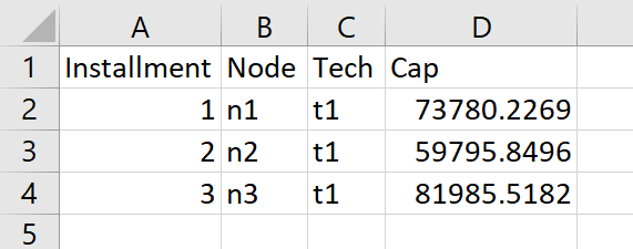
In this example, nodes n1, n2, and n3 all have installed technology t1. The capacity indicates how much product is being processed at that technology site.
Results Summary File
The results summary file contains an overview of the economic performance of the system. This is the same information displayed when you first click View Results.
An example of the Waste to Energy result summary is shown below. For the interpretation of this file, see the top of this tutorial.
Supply Results File
The supply results file contains information on each supply node and the amount of product that they are supplying in an optimal system.

In the Waste to Energy example, supply node, s1, supplies 65,000 units of cow manure (p1) at a price of -$5 per unit. The negative price indicates reverse money flow (i.e. the supplier pays the customer).
Technology Site Results File
The technology site results file shows how much product is processed at each technology site in the optimal system.
In the waste to energy (low electricity price), there were no tech site results. The example below is from a different model.

These results indicate that the tech site, t1, processed 10,000 units of product.
Visualization Tool
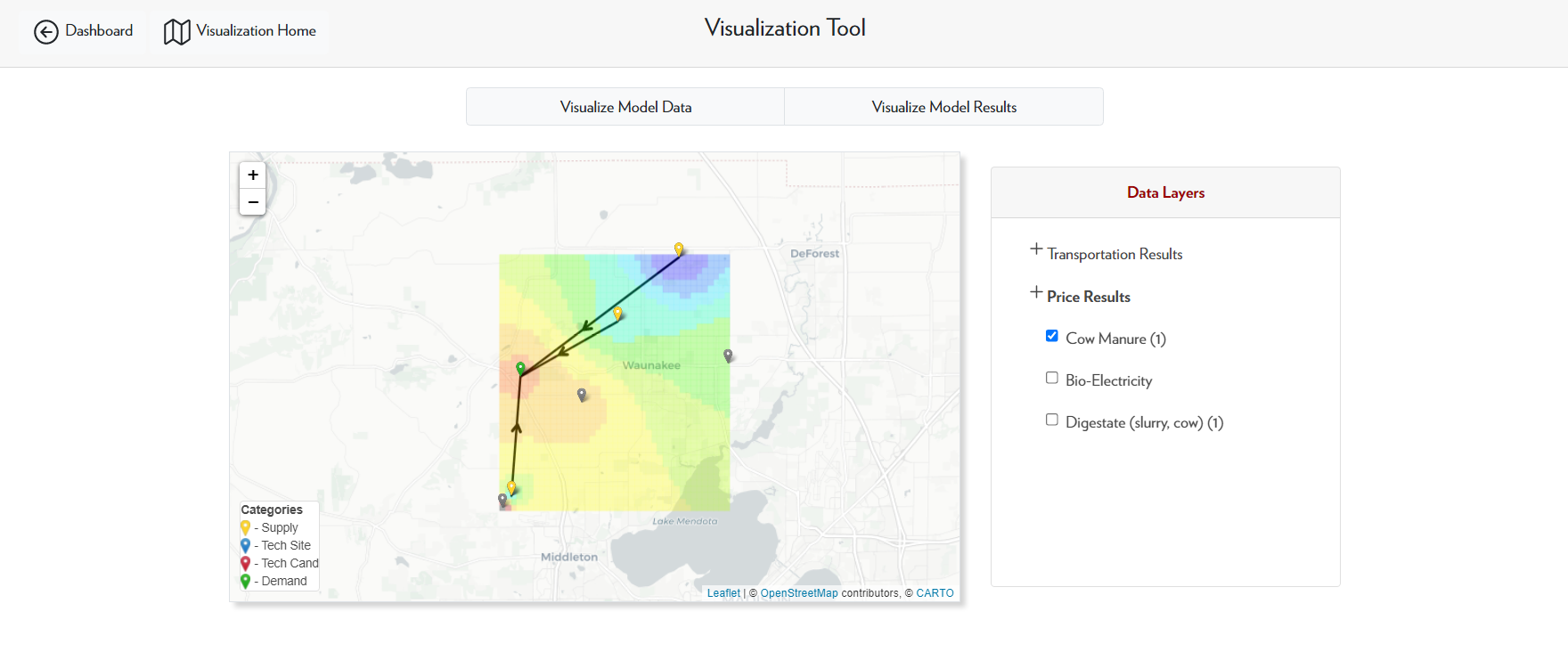
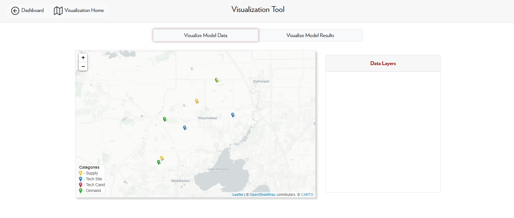
Clicking the button under the Visualization section will take you to the visualization tool where you will see an empty map along with two buttons labeled Visualize Model Data and Visualize Model Results.
Selecting Visualize Model Data will display the nodes from the model onto the map.
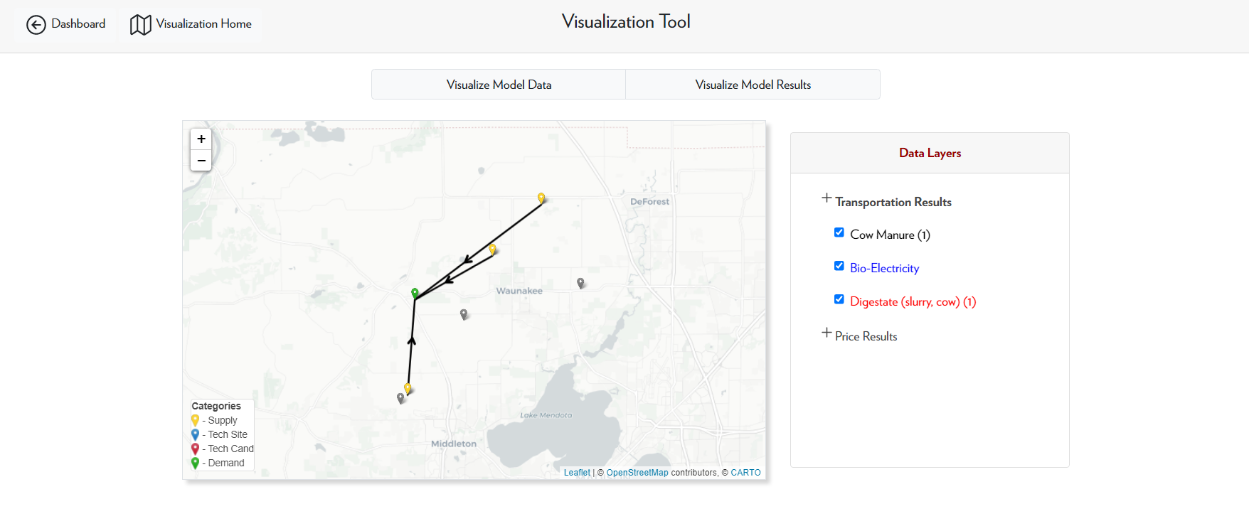
Selecting Visualize Model Results will display the transportation results. The grey nodes indicate nodes that do not participate in the system. You can toggle which transportation paths to view by checking and unchecking the data layers under transportation results.
You can also view the price gradients for each product. Red areas indicate high prices and blue areas indicate low prices.
